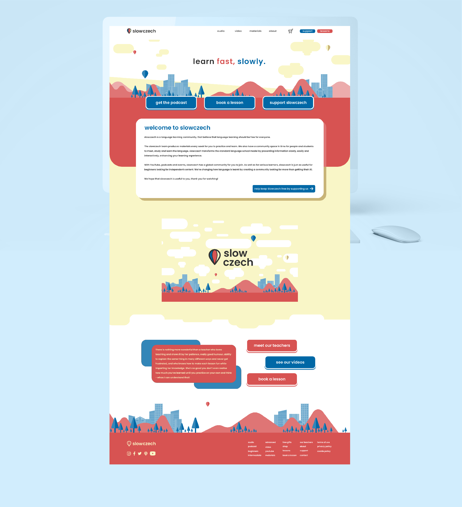
Slow Czech Rebrand Strategy
A full rebrand of a wonderful Czech language organization. The business is focused on digital learning and aiming to keep learning free for everyone. The business has a podcast channel, YouTube channel and its own website, as well as a community office in Brno.
The rebranding has been actioned to bring the brand in-line with the quality of the materials and to help increase the brand equity among not just the Czech learning community, but in language communities in general.
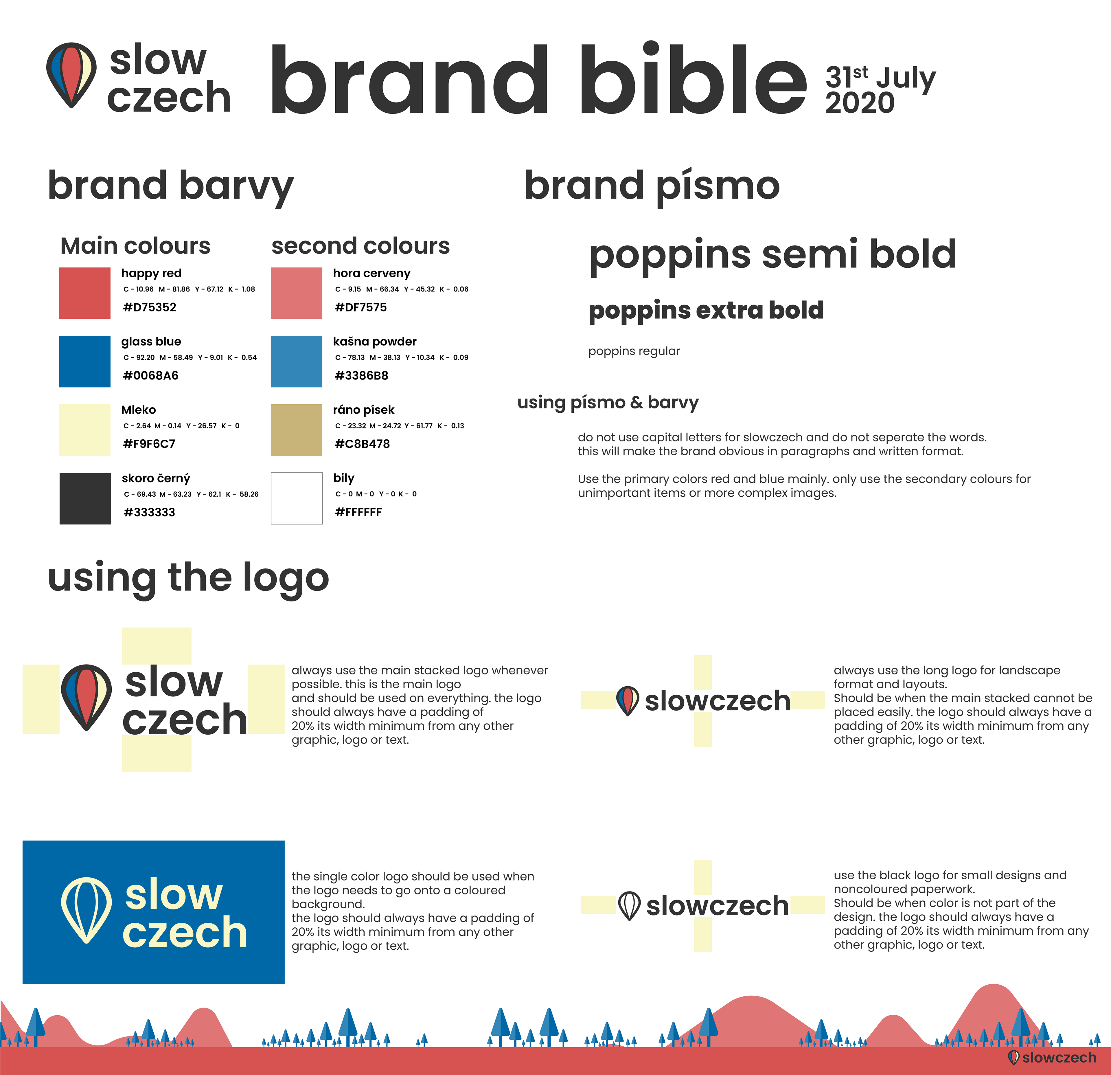
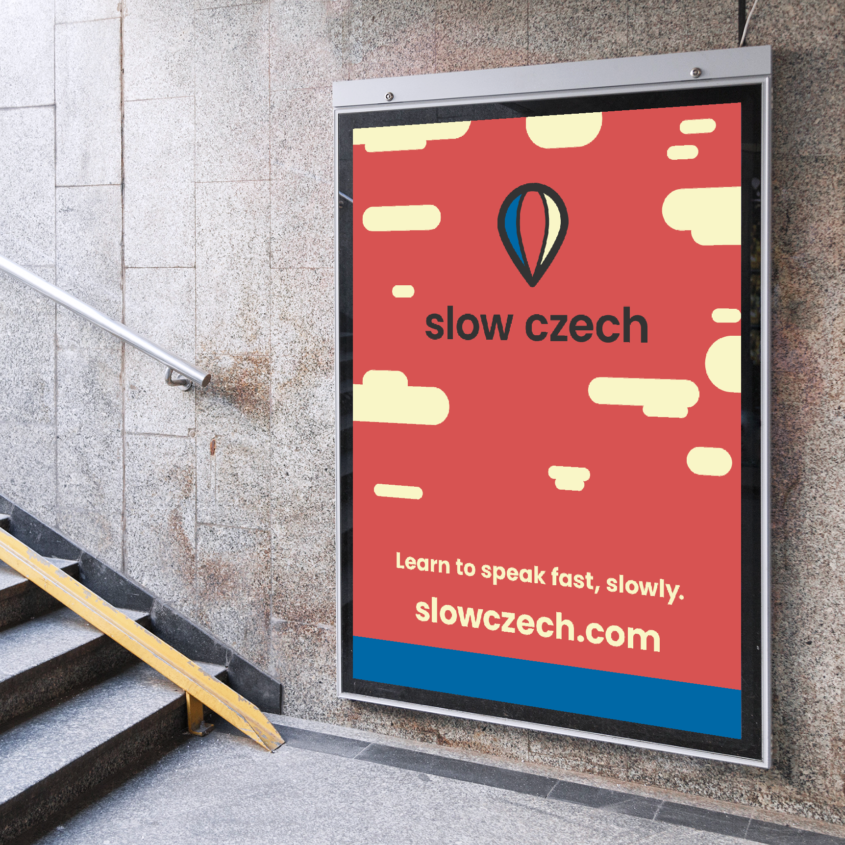
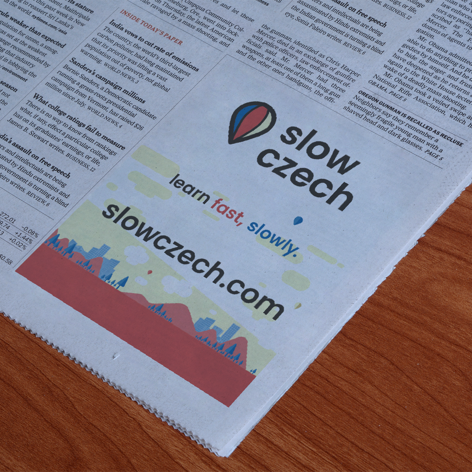
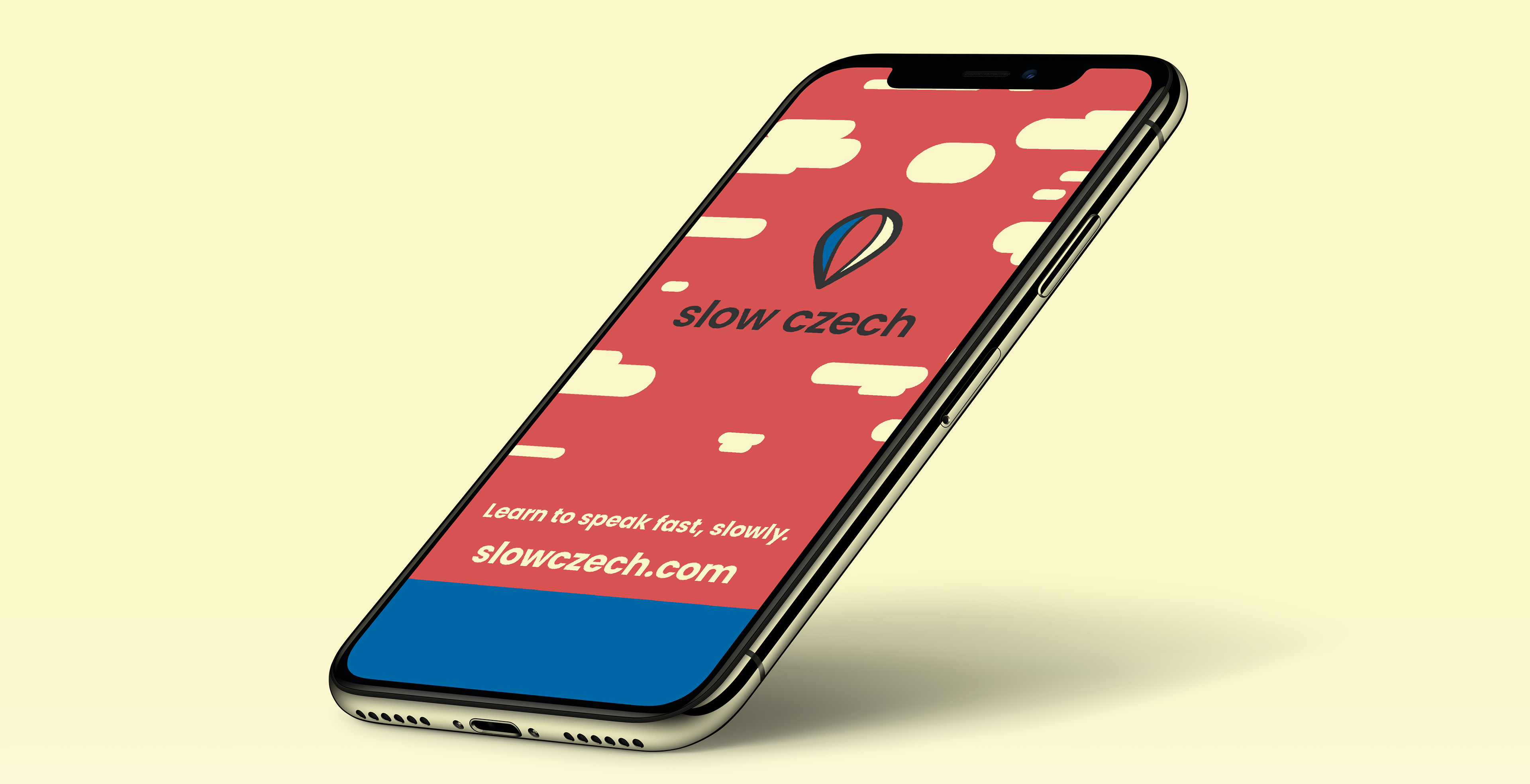
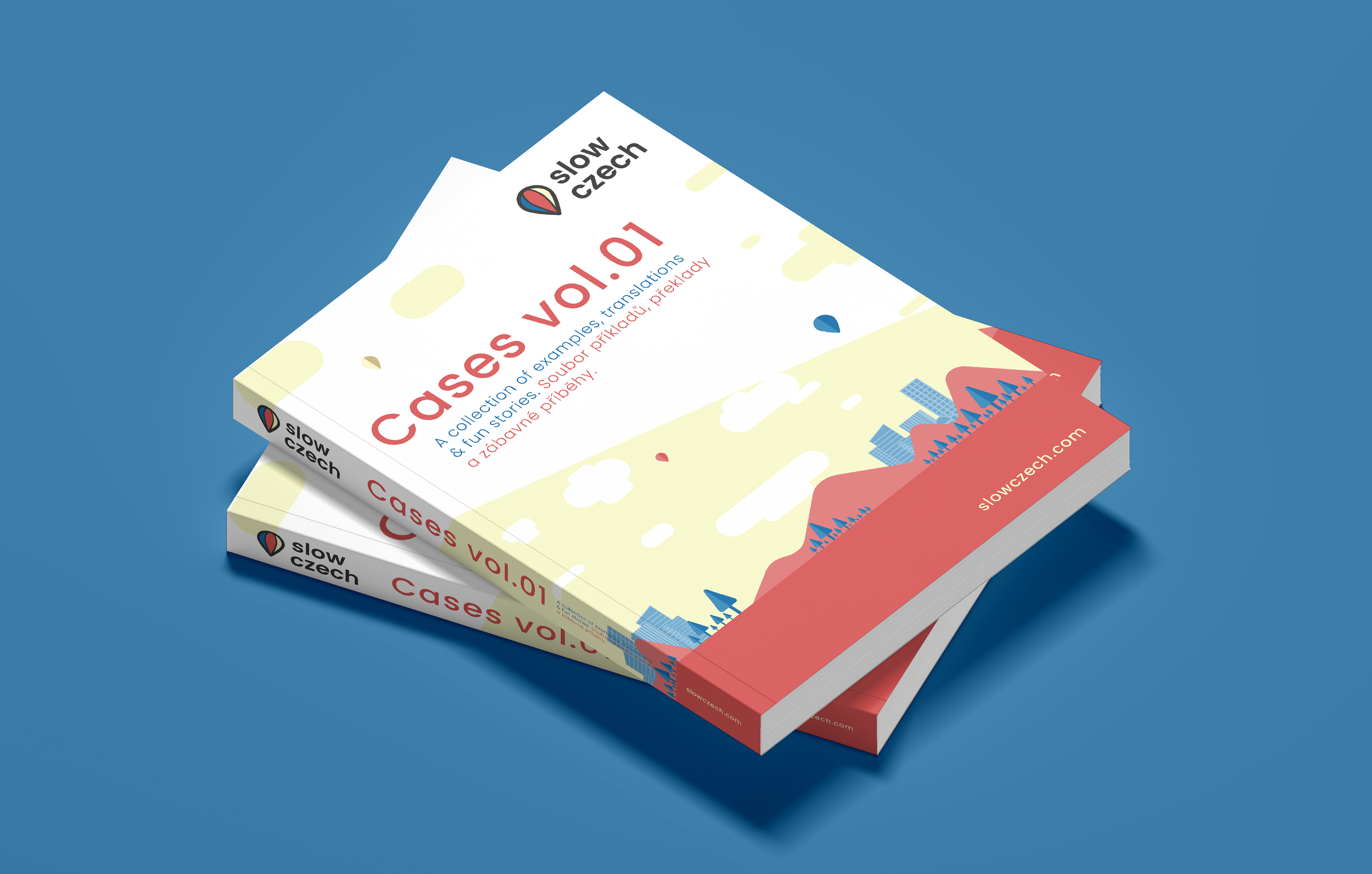
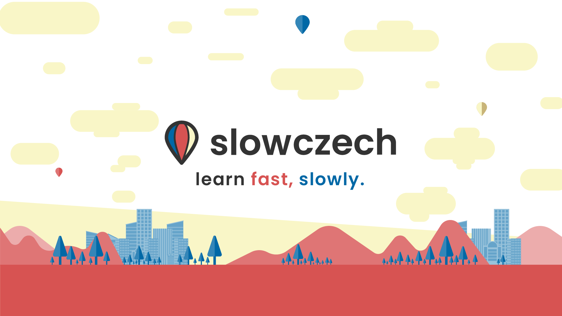
The objective is to have the iconography be approachable, friendly and convey the effectiveness of learning and speaking slowly to master a language and acknowledging the patience and strength of learning a new language (especially Czech).
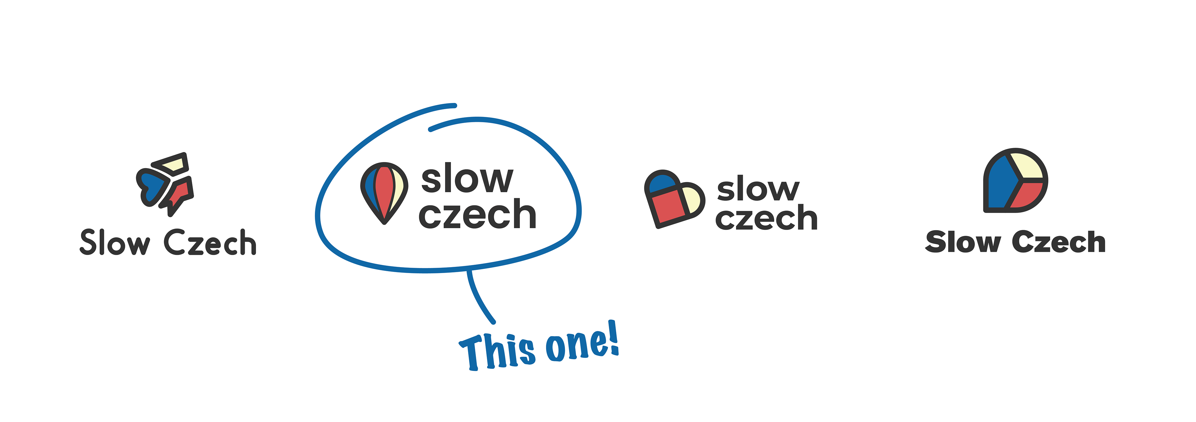
The selected logo helps illustrate the message and idea of the business most effectively. A hot air balloon is a slow method of transport, but will always get you to where you want to be, provides a great view of the landscape and is a much more enjoyable journey than a car! The simplicity of the logo also leans into a geographic icon, representing an objective to go towards.
The colors are of the Czech flag, but added in a softer palette, creating a more approachable and less aggressive feel. The font, Poppins, is a web safe sans-serif font, with loads of versatility and a great bold typeface, that also a nice modernal cheerfulness.