
The client is a business that delivers online courses and an app for learning Mandarin, which stand out because of their product delivers an ease of learning.
The target audience is business orientated men ranging mid 20s to 40s. The client wants a brand that conveys a sense of professionalism while at the same time being modern, as well as develop a brand that is future proofed to go beyond the current business remit in the future.
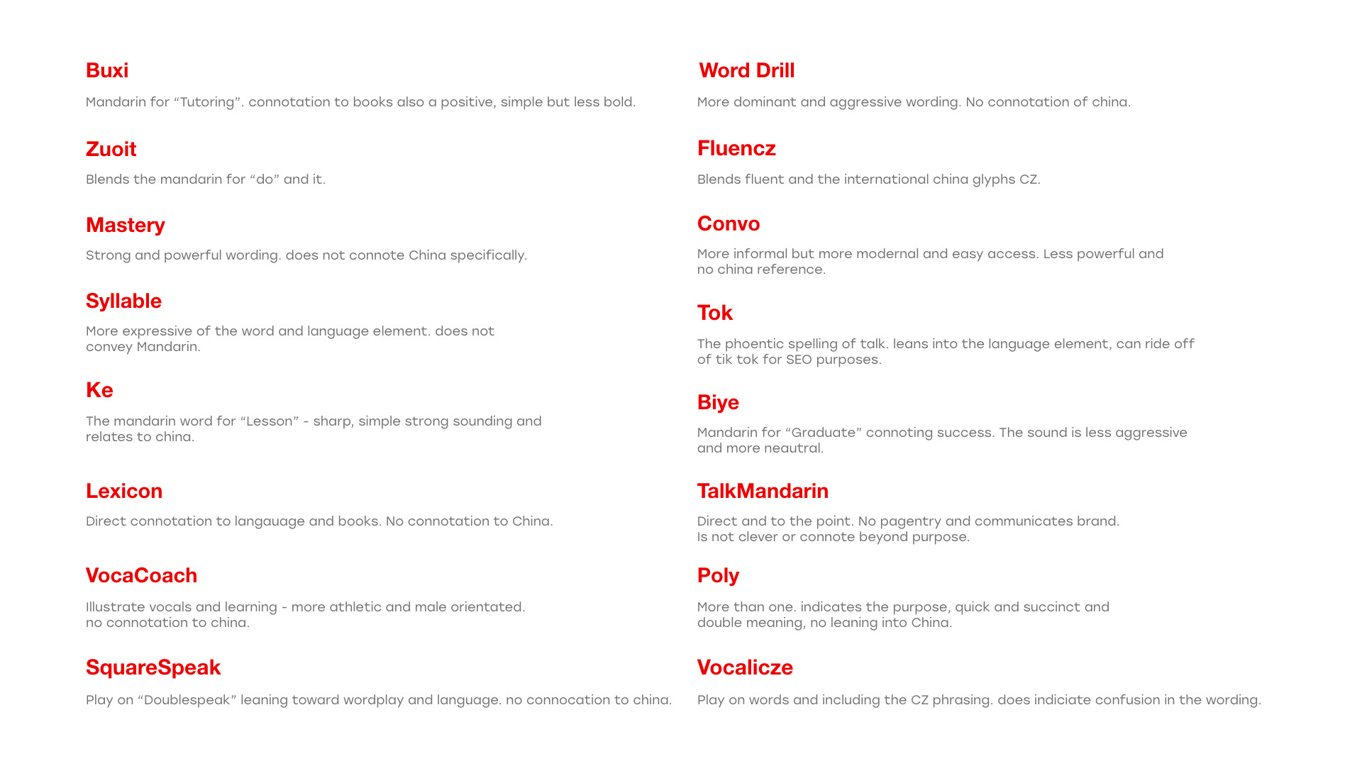
The first pass of brand names resulted in the above 18 results for potential brand names. At this stage, all of the above have been reviewed, and weaker names have been removed. Post this we had 6 which required additional editing.
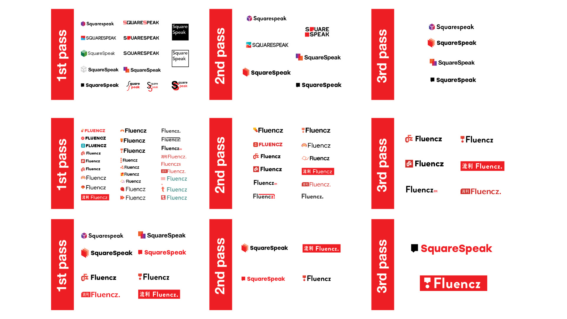
For each of the brand name’s there were 3 passes to narrow down results, then an additional 3 passes comparing these two brand names with each other and further refinement. In total there were over 80 iterations in development resulting in the final logo designs.
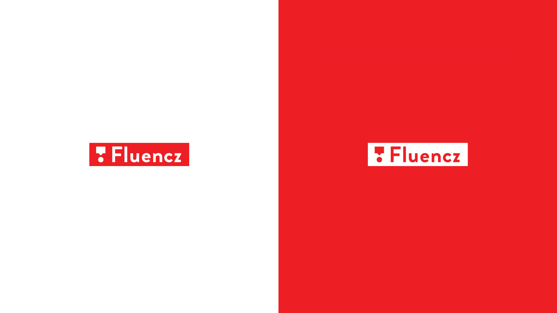
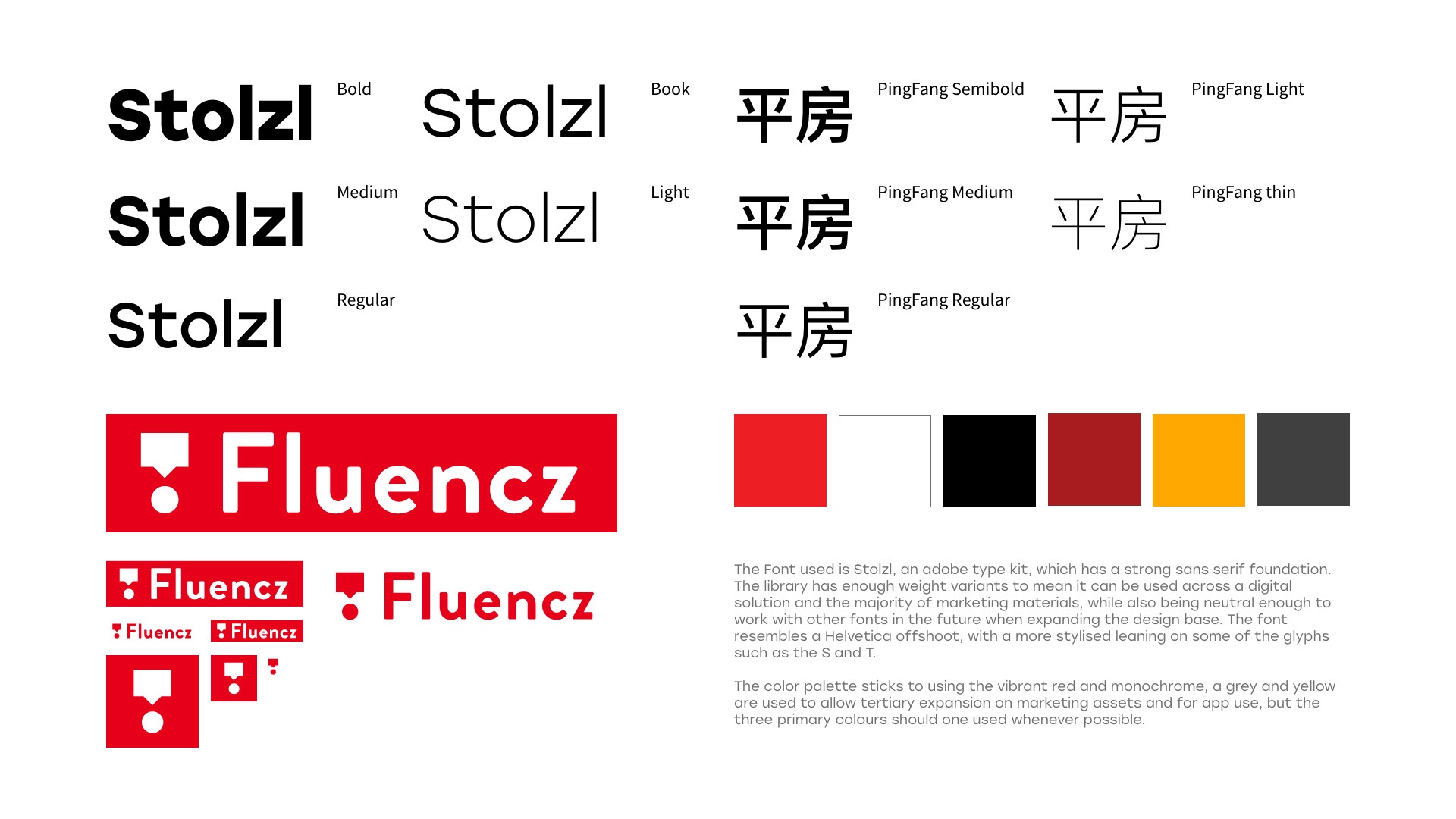
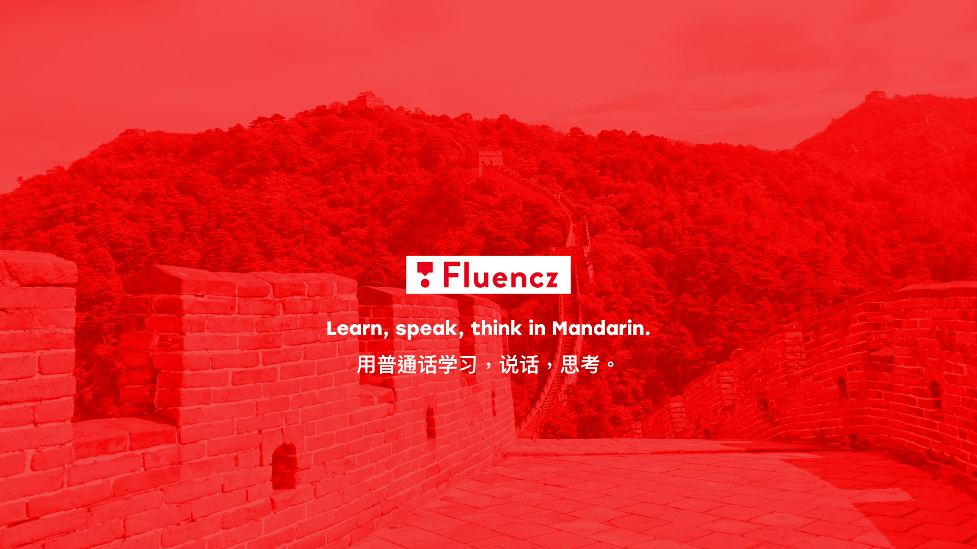
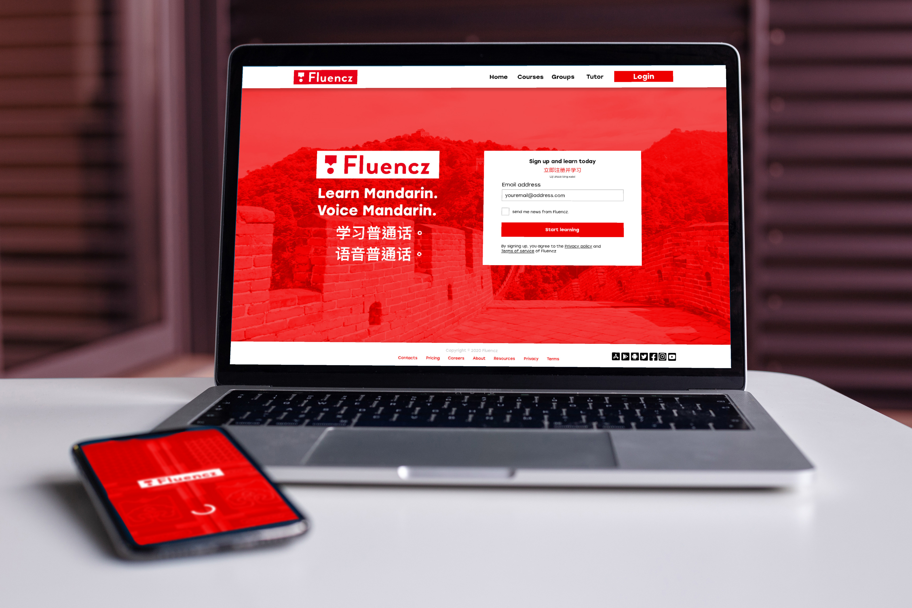
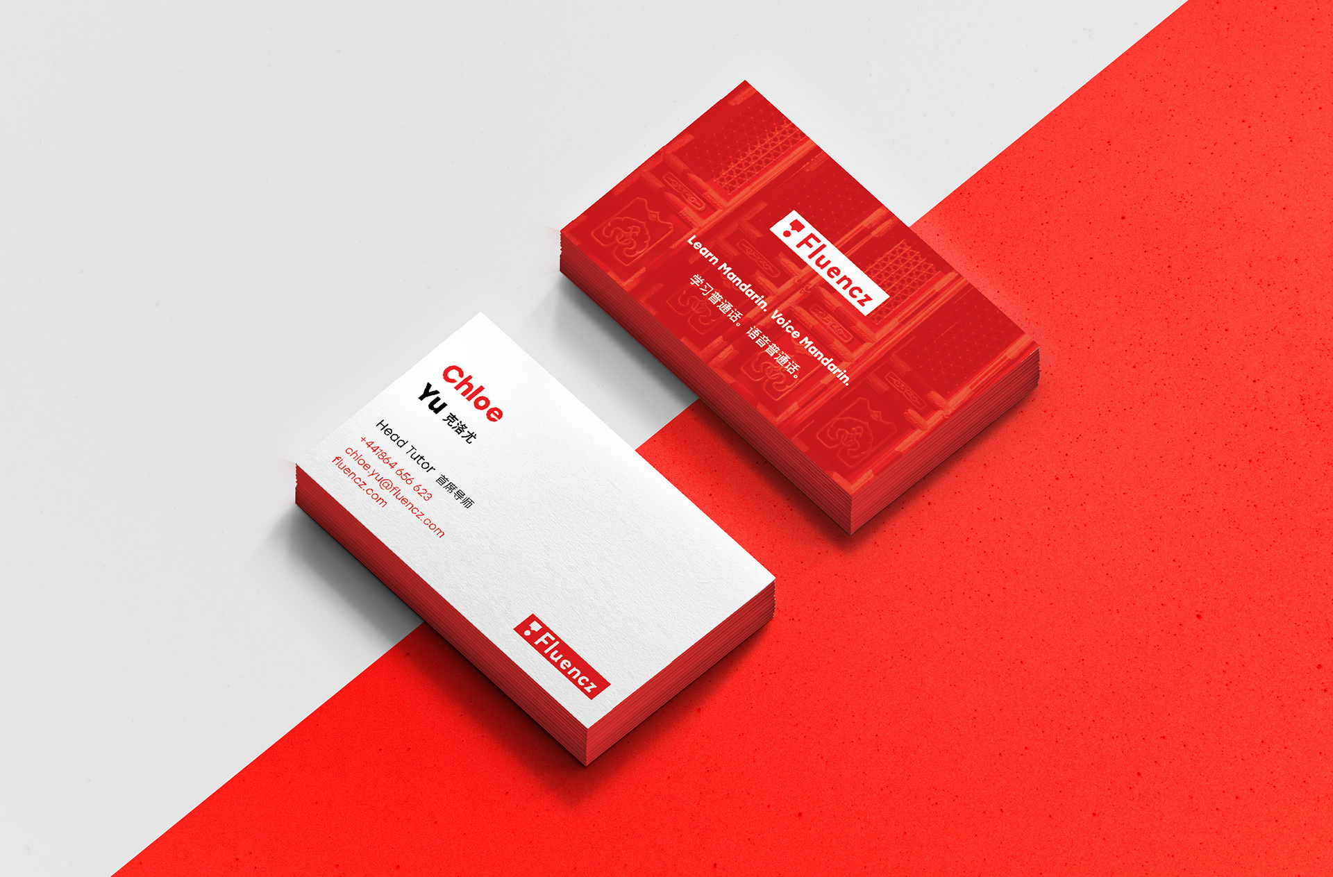
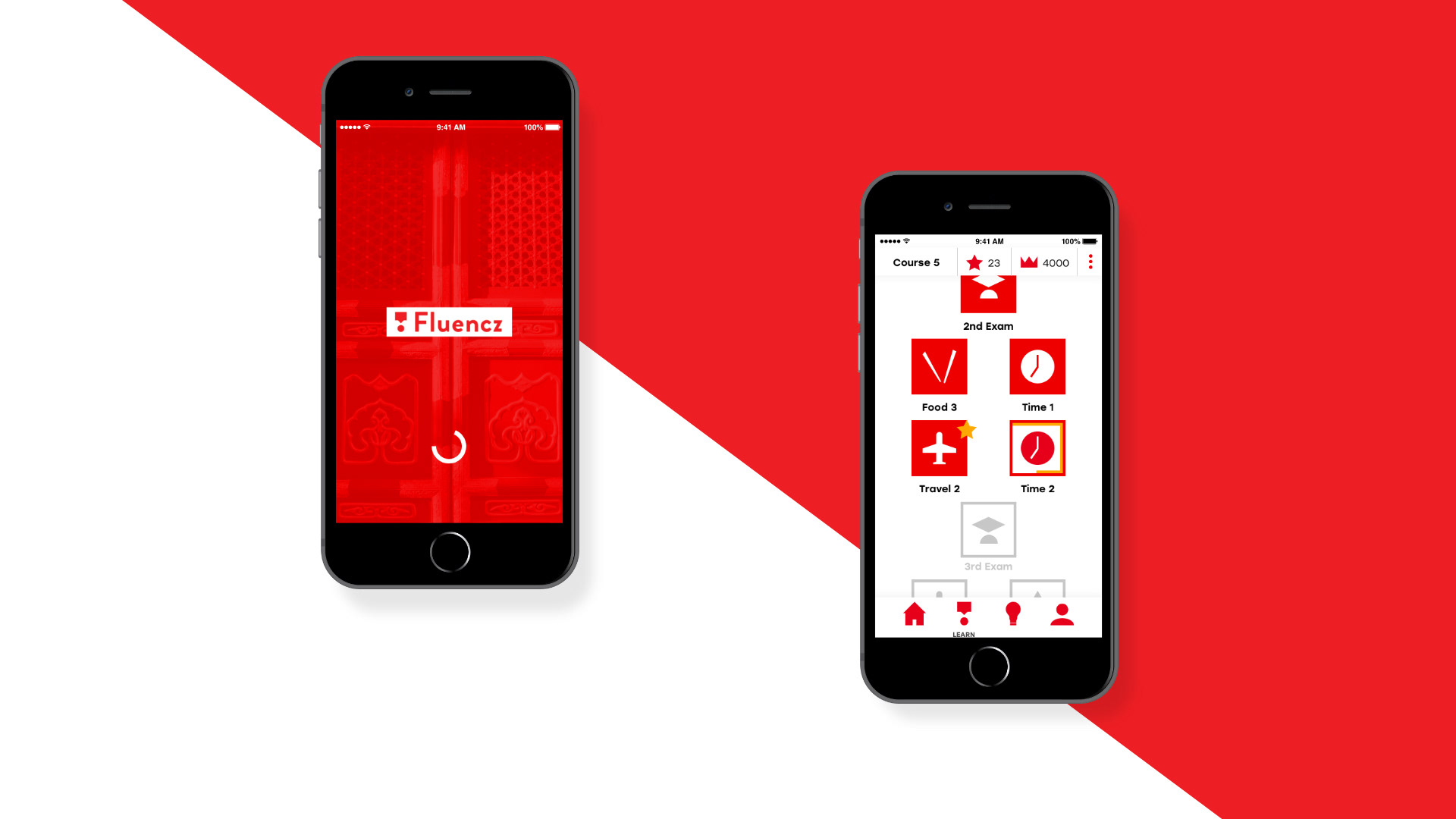
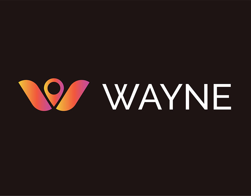
The end result is a logo which help convey the objective of the brief while also allowing room to expand the business at a later stage. Using a strong bold sans serif font (Brandon Grotesque) giving a sense of robustness and a professional quality.
The logo marks uses minimal shapes for a modernal and effortless feel, which also helps communicate the service is easy and accessible. Realistically, either logo needed to include a logo mark along with the word mark for digital use and to convey the business being digitally orientated. Color use of black white and red leans into the china aesthetic, with red being good luck and indicates no unneeded bells or whistles are part of the service.