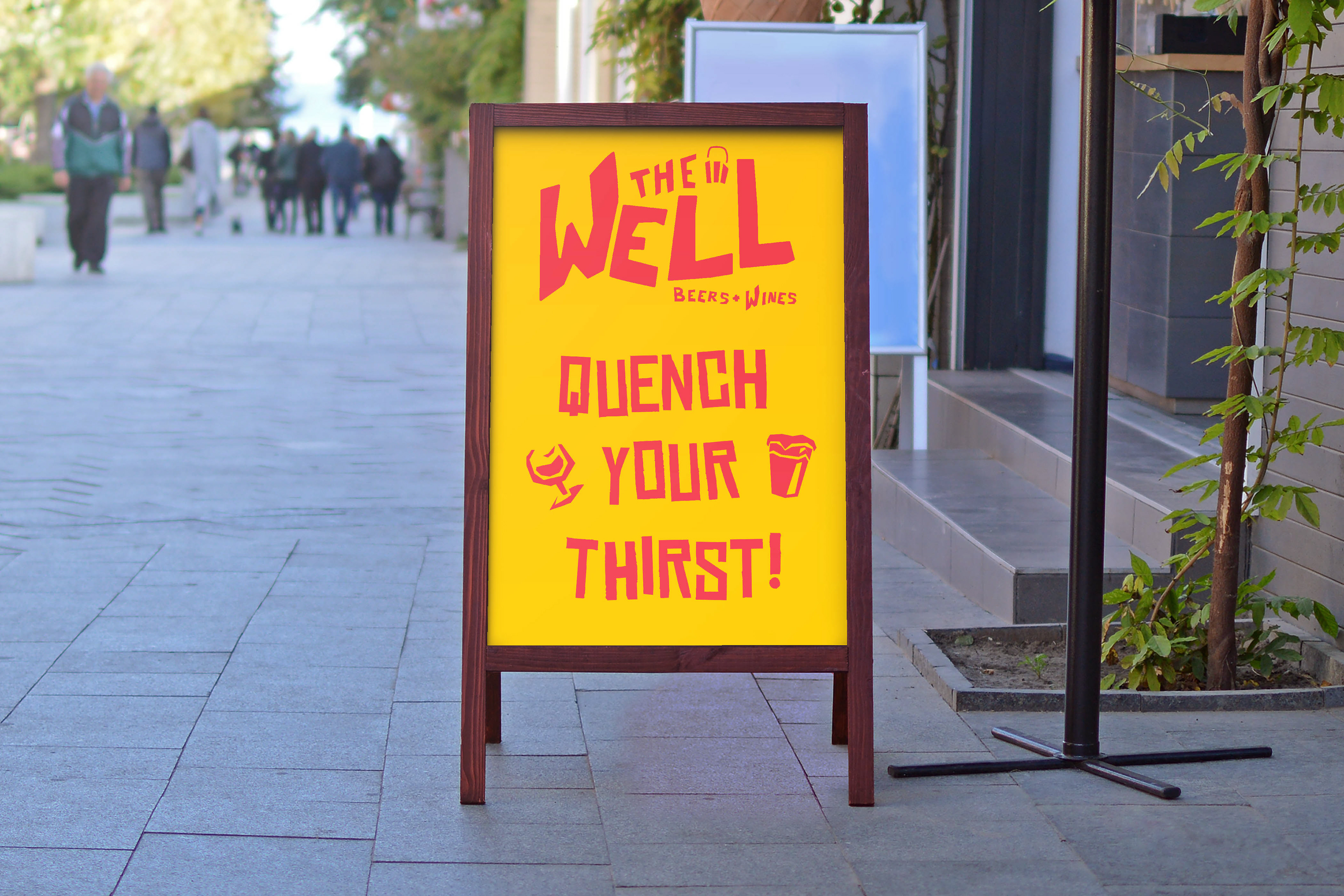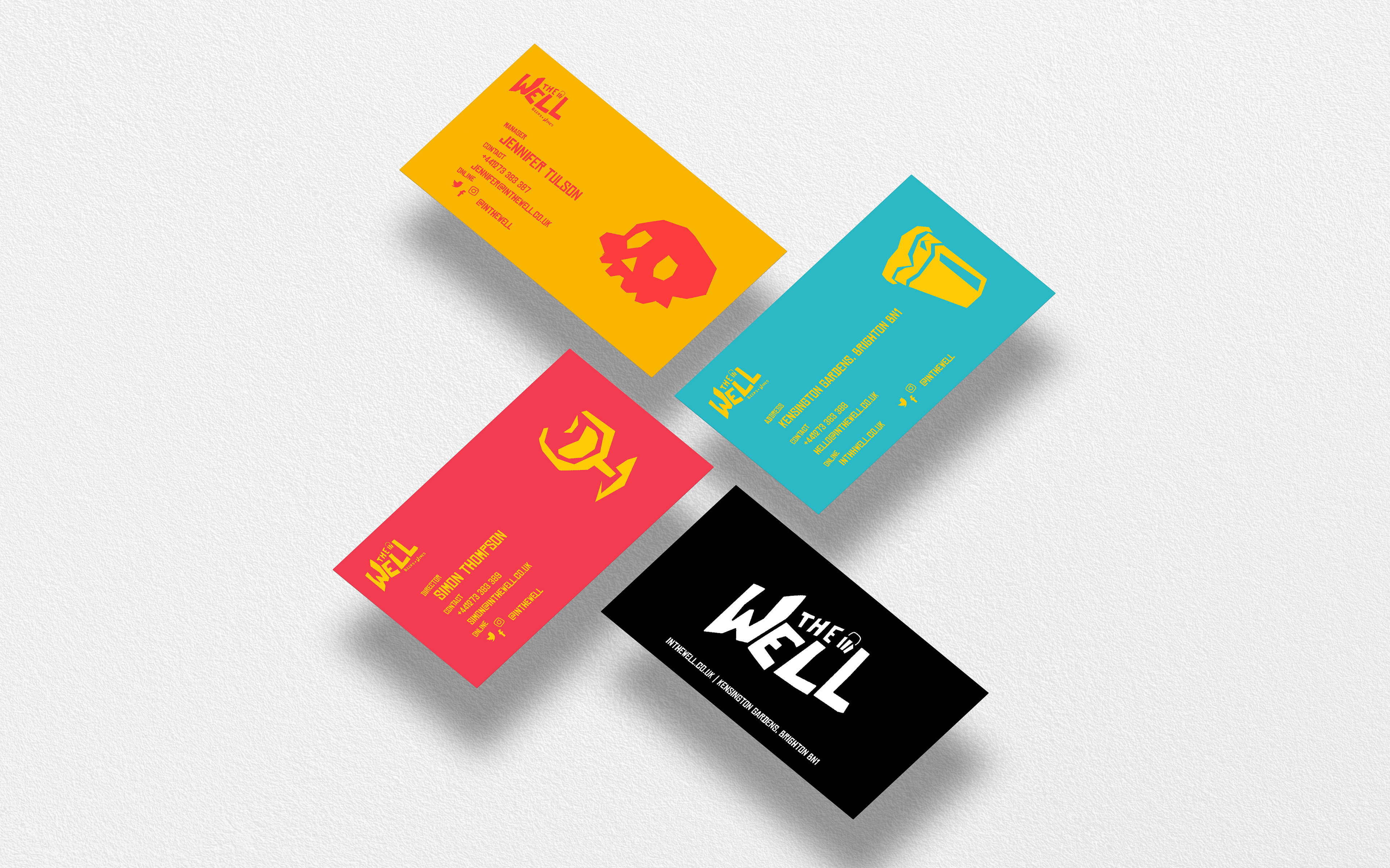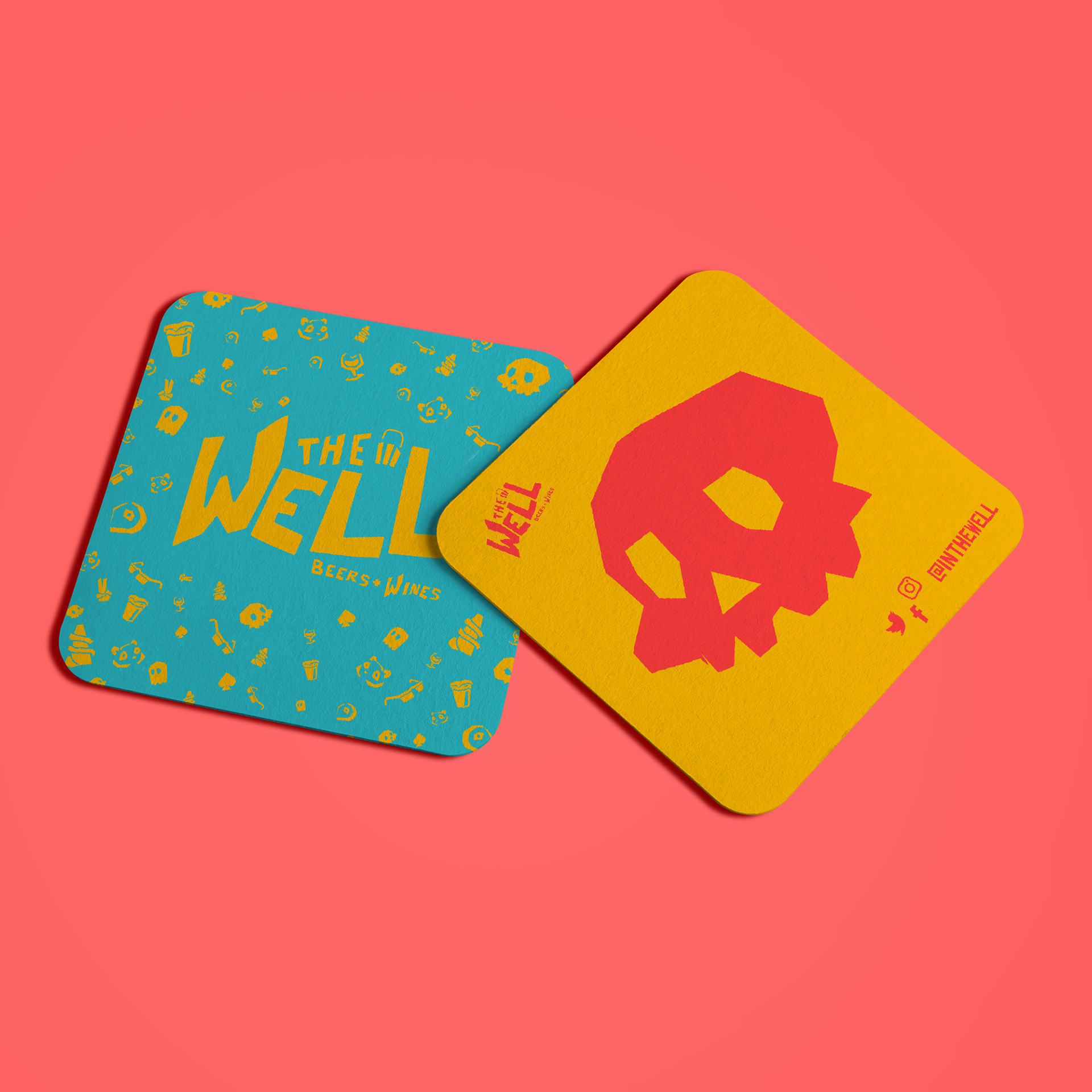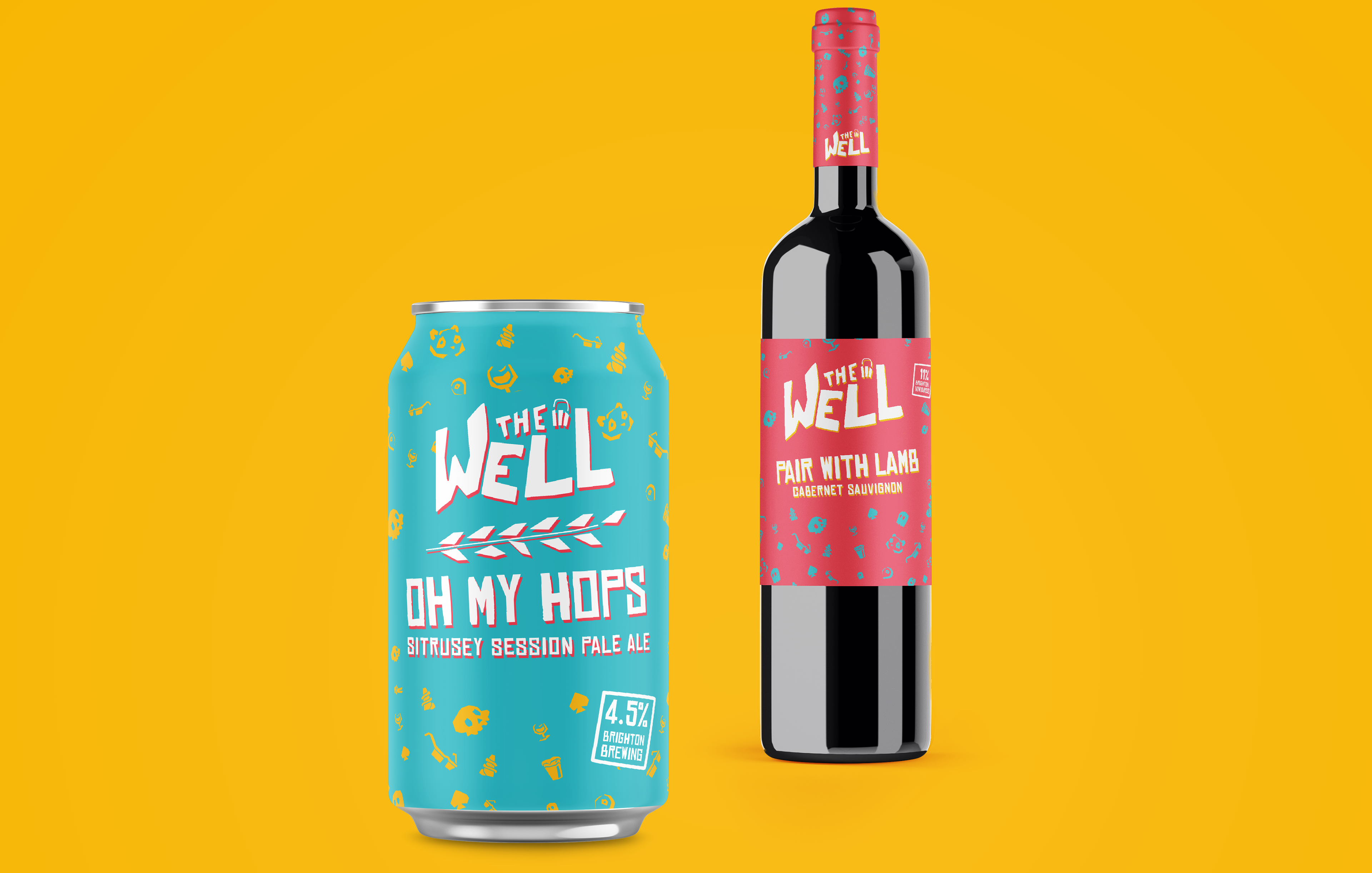
The Well is a Beer and Wine Store based in Brighton, UK. Its focus is on selling local products, being a central hub for the beer and wine community and a platform for their own brewing.
The visual identity desired by the client was youthful, funky and alternative. The primary identity colours are monochromatic with violent neon red, yellow and cyan for boldness and energy. Rather than using a well as the visual identity, I used a bucket instead both as a hands on vessel of liquids, and as a callback to Brighton beach using buckets on the sand.
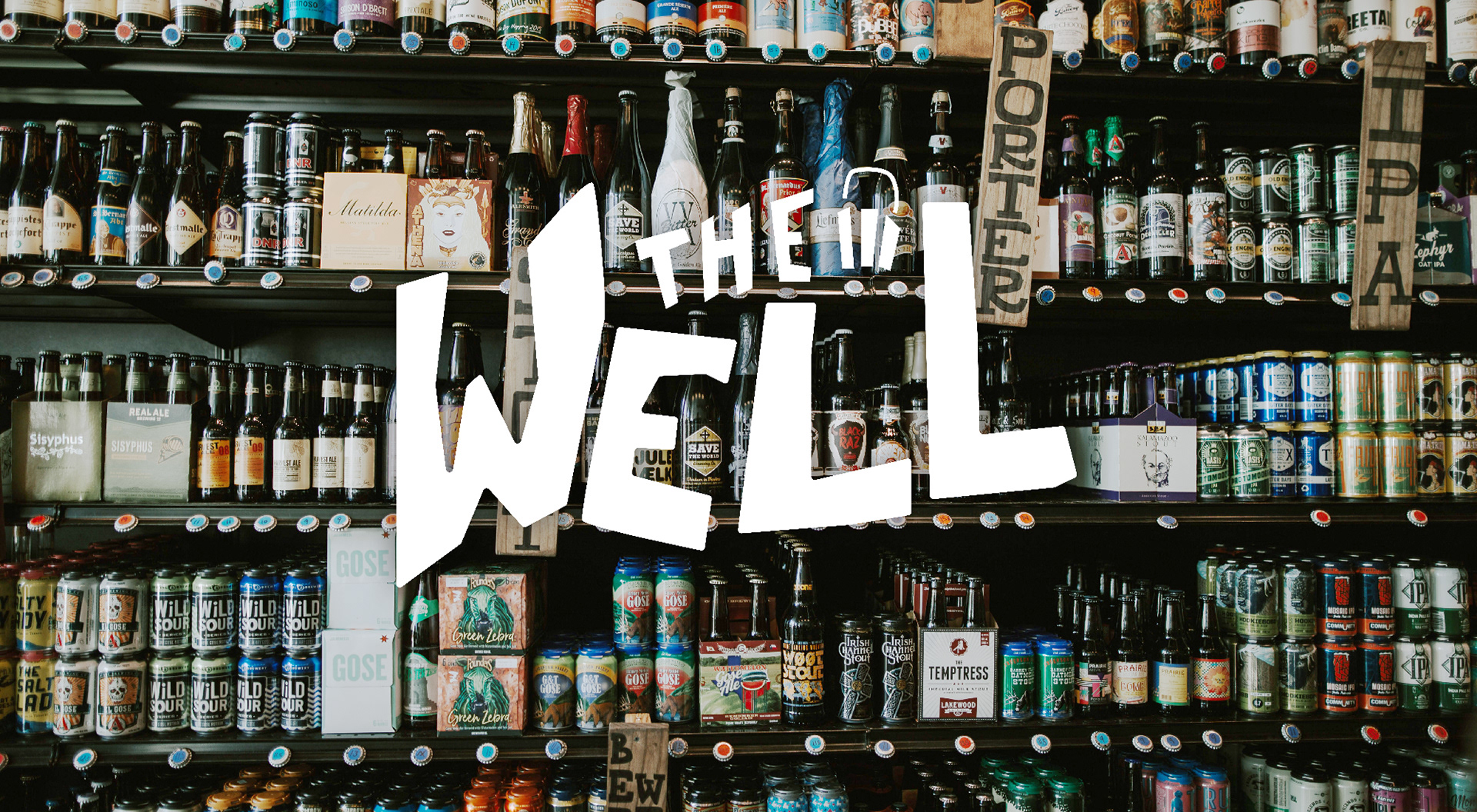
The typeface is bespoke and designed to resemble cutout lithotype to give an anarchic and zine feel. A supporting type face (Chinese Rocks) was selected as it has a similar cutout feel, but is more regimented and easier to read on on smaller stationary items.
Deliverables included: signage, leaflets, business cards, Can art, motion logo and wordmarks.