PotBots is a THC edibles brand, specialising in chocolate edibles and sweets.The brand focus is on capturing members of the market who may not connect with weed culture and expand the edibles into a more cental and acceptable social position.
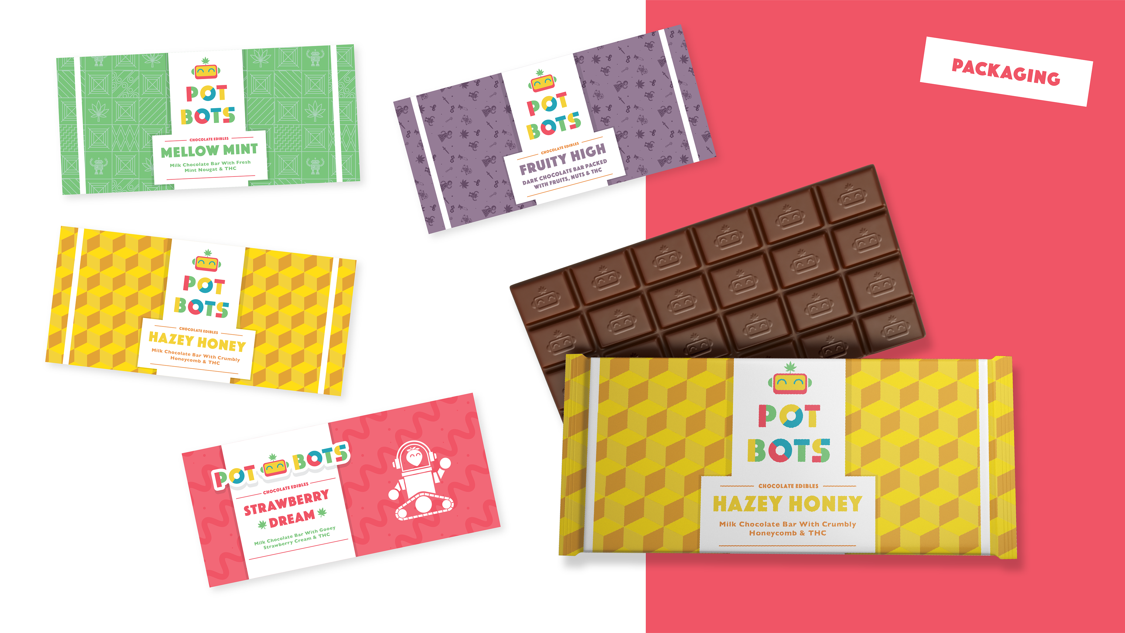
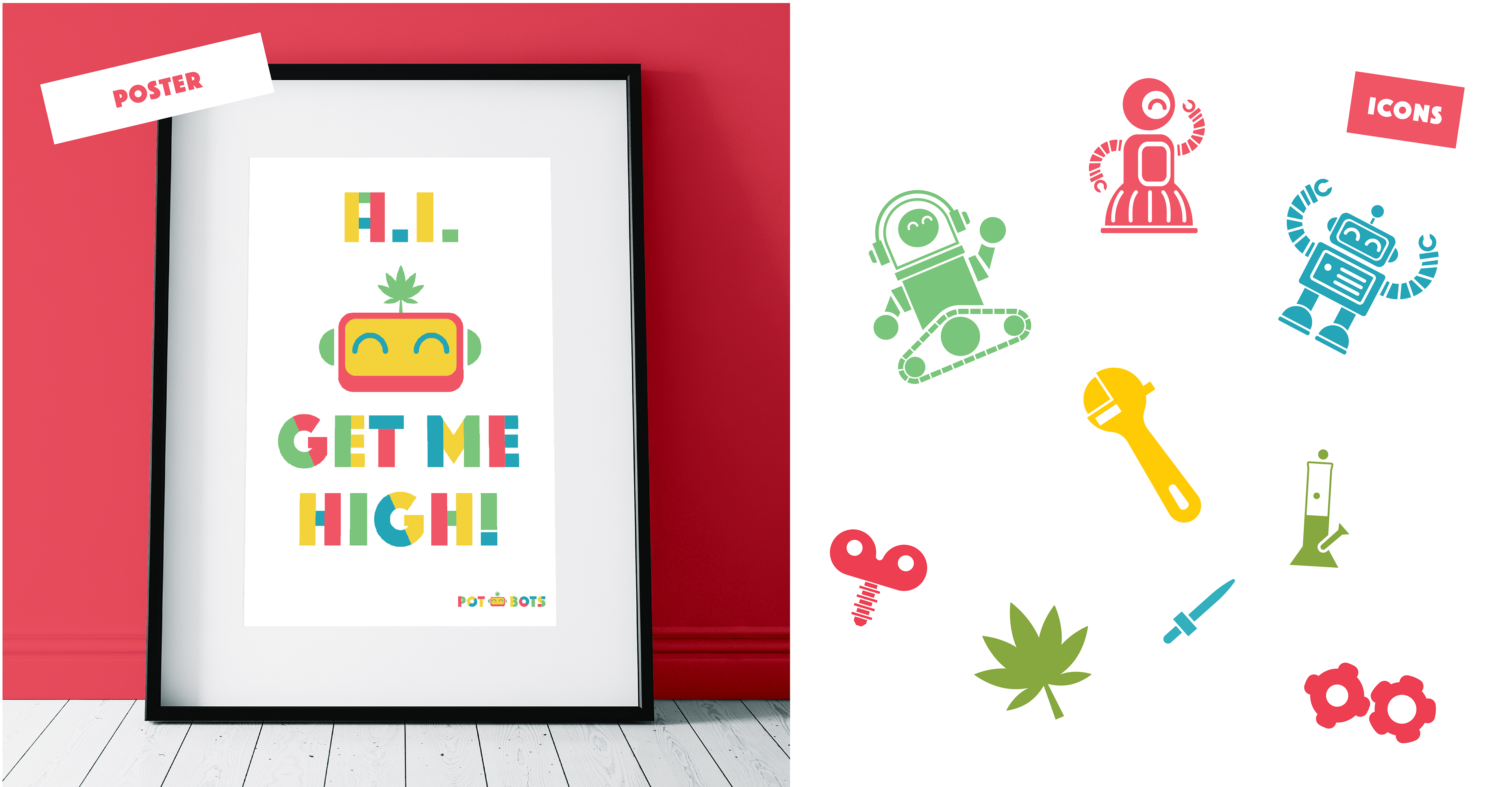
Deliverables included: signage, leaflets, business cards, wordmarks, packaging.
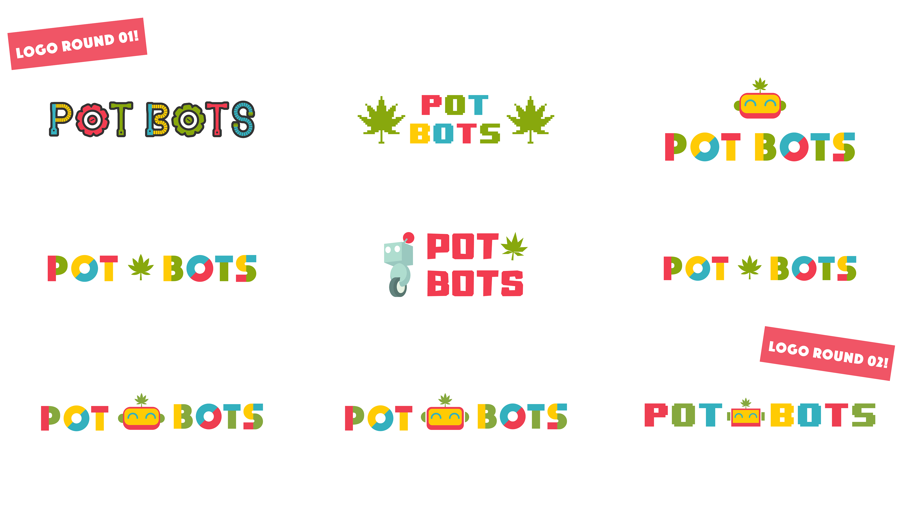
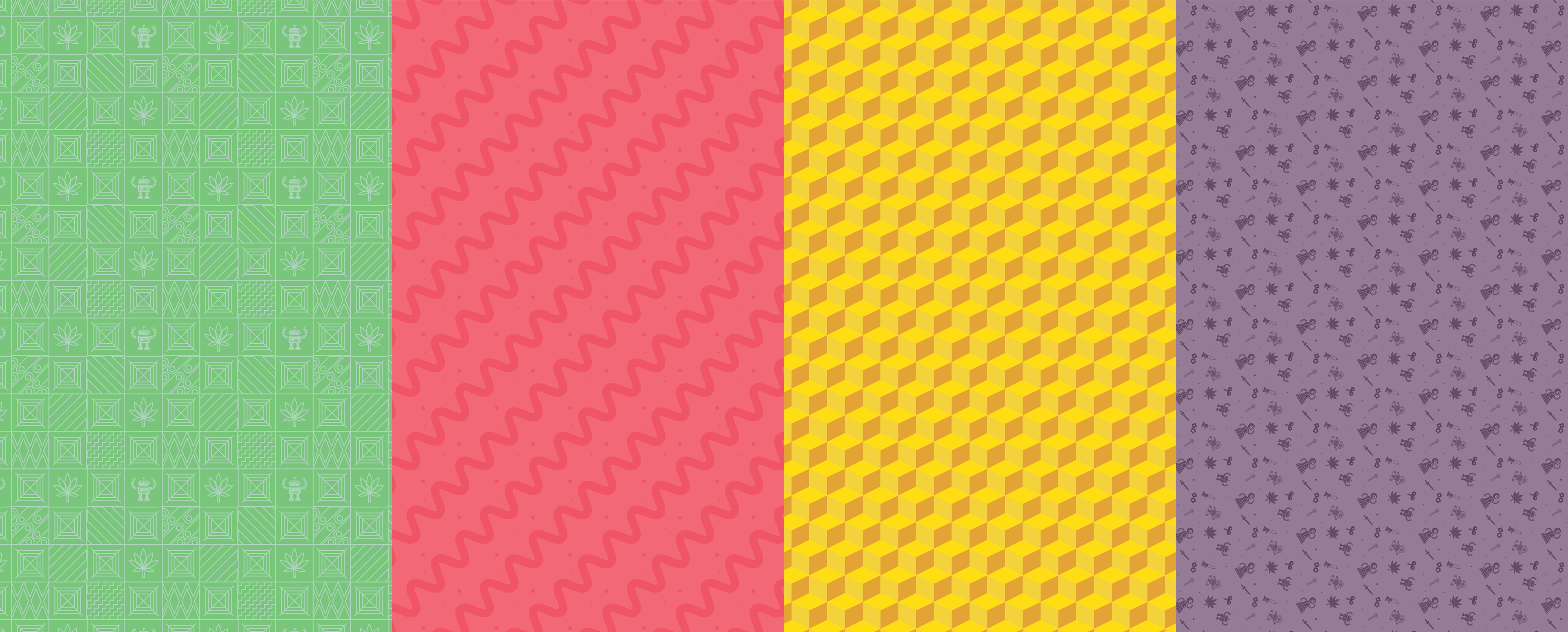
The visual identity desired by the client was approachable, colourful, kawaii and fun. The primary identity colours are off saturate primaries + yellow.
The idea being to demonstrate vareity and fun, while also being associative to nostalgic or culturally acceptable short hand (board games, video games etc.) The visual identity was important to use robots as the primary icon, and a few rounds of ideation were completed before developing the final character mark, which balances a sense of technology and modernity, with kawaii culture and warmth.
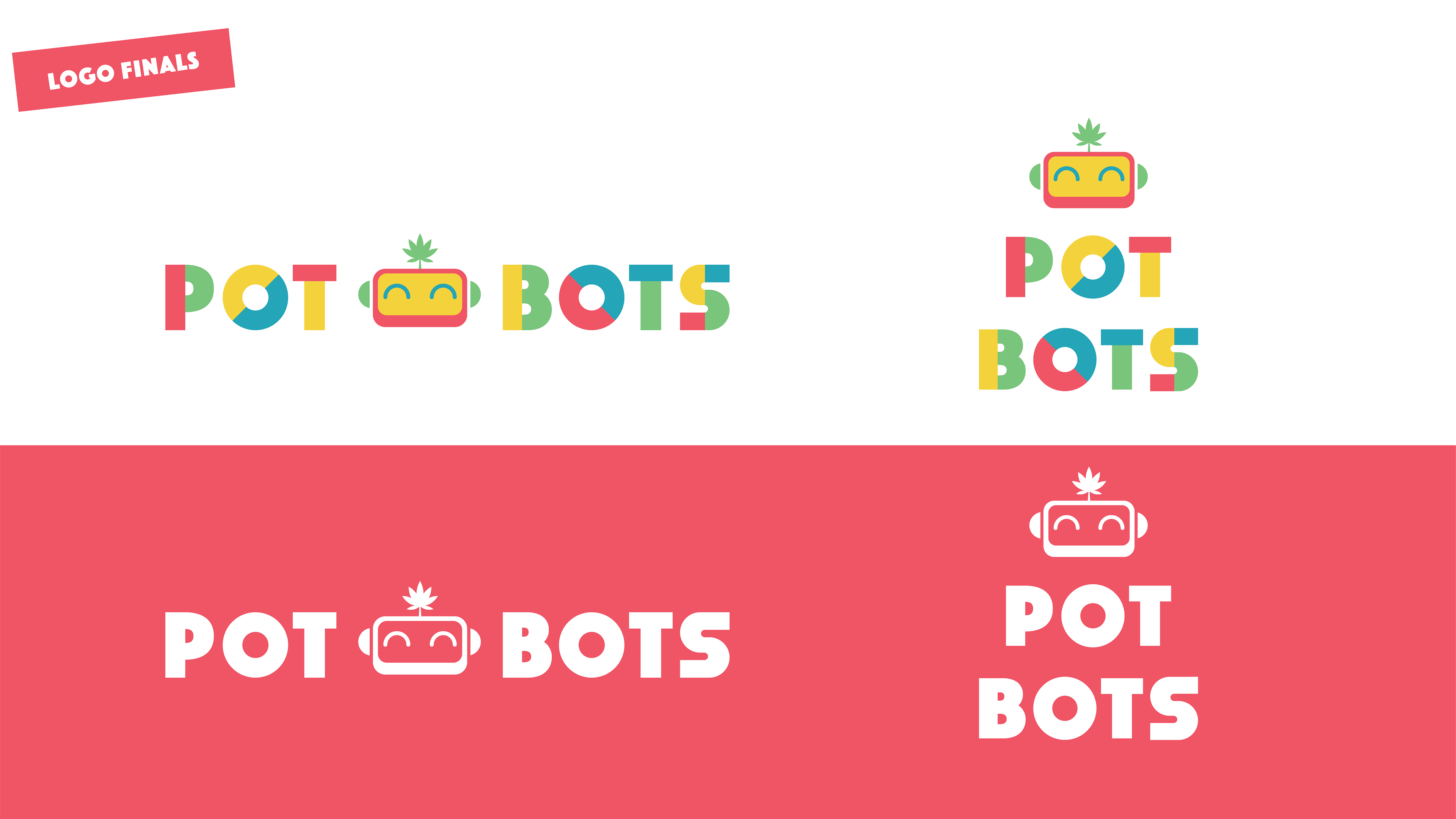
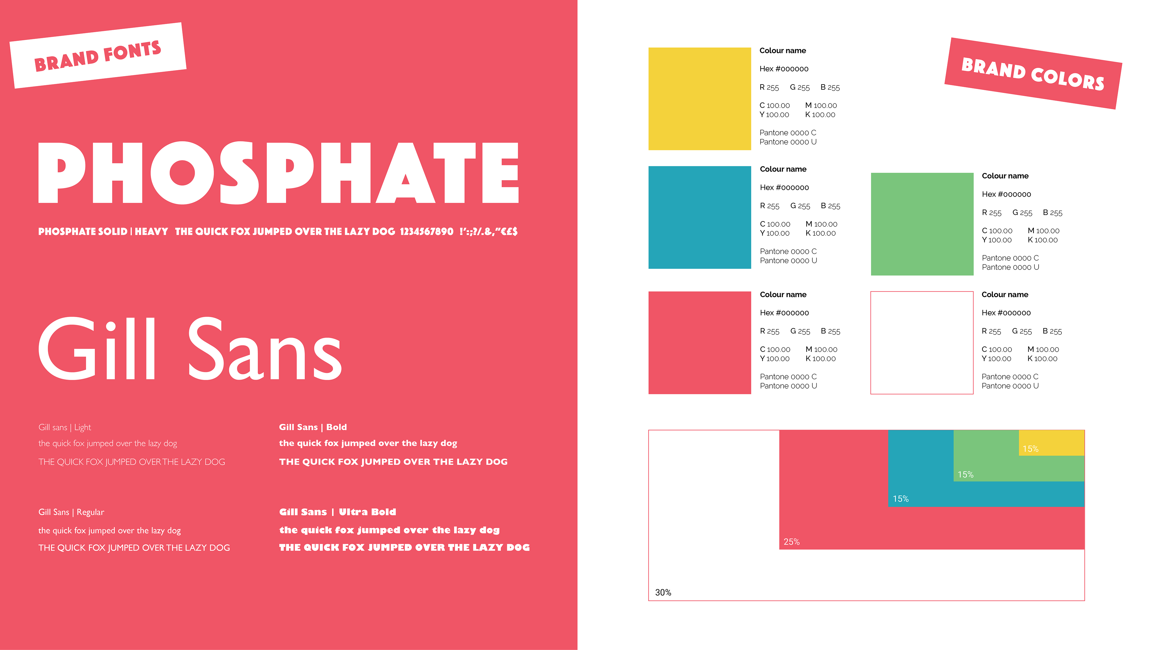
The typeface is bespoke and designed to resemble building blocks and simple shapes. A supporting type face (phosphate) was selected due to its similarity but also has a nostalgic futuristic feel, alongside Gill sans for more standard usage.
Along with this the brand palette was selected based off the final logo design. The colors as previously mention are set up for a vivid palette and association with ancillary products and items (players colors in a board game or video game). Rather than have these colors really saturated, they have been cooled down to give a more modernal and sophisticated tone.
For the packaging, it was important for the client that the packaing have unique patterned backgrounds for different flavours. As such textures and icons were produced that stayed within the guidelines of what has already been prepared from the initial brand work, adhering to the colors and aesthetic style as much as possible.