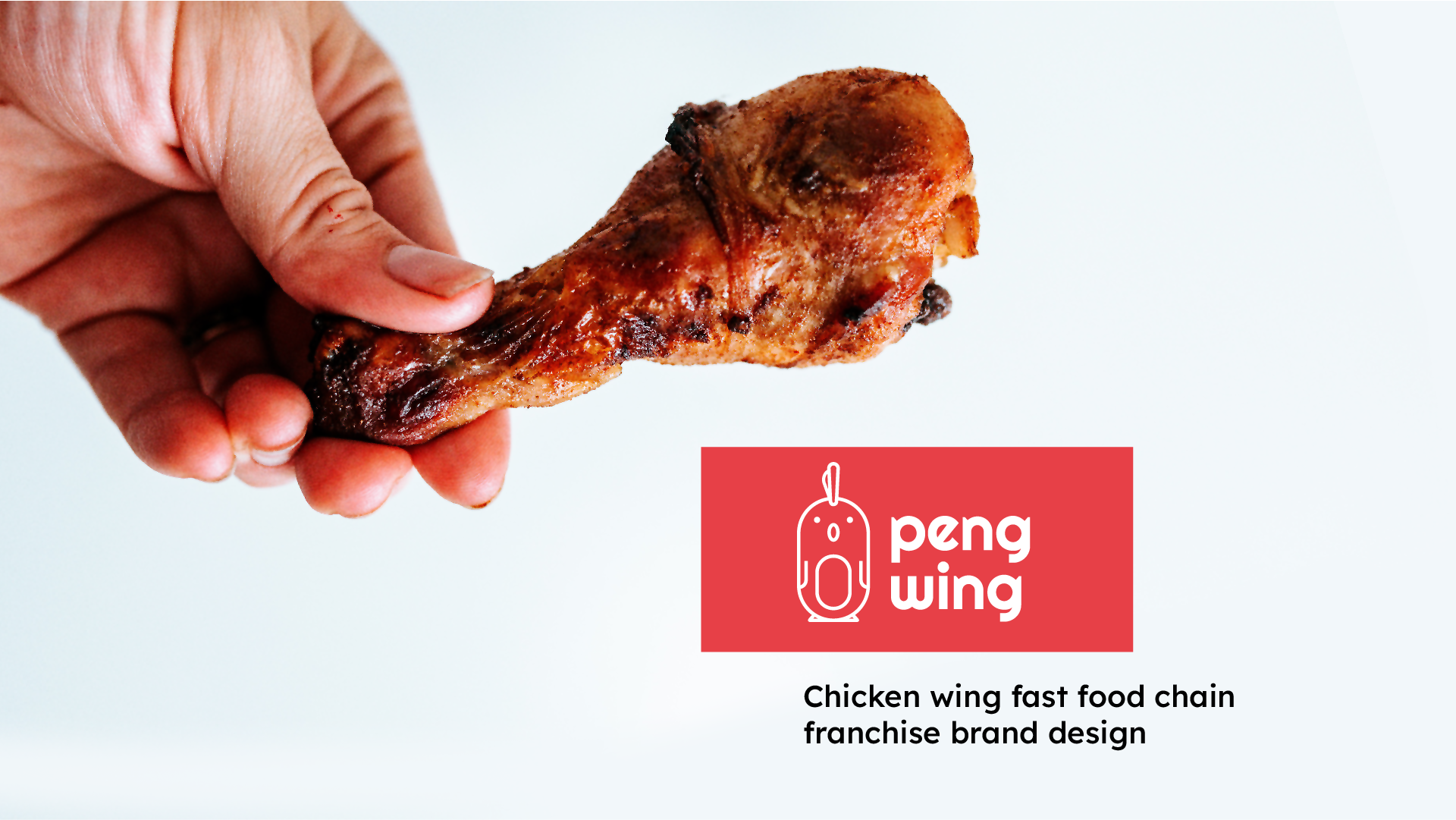
An already successful and growing restaurateur wanted to expand into a new franchise, starting in Central London. The client wanted to expand into what is a rapidly growing market in fast food, specializing in Chicken Wings.
The name had already been selected for the new brand and the Target market was a younger demographic of 18–35 years, fast-food enthusiasts with free capital and desiring a fast food third space environment. The brand also needed to have flexibility to expand into other markets in a few years, such as families.
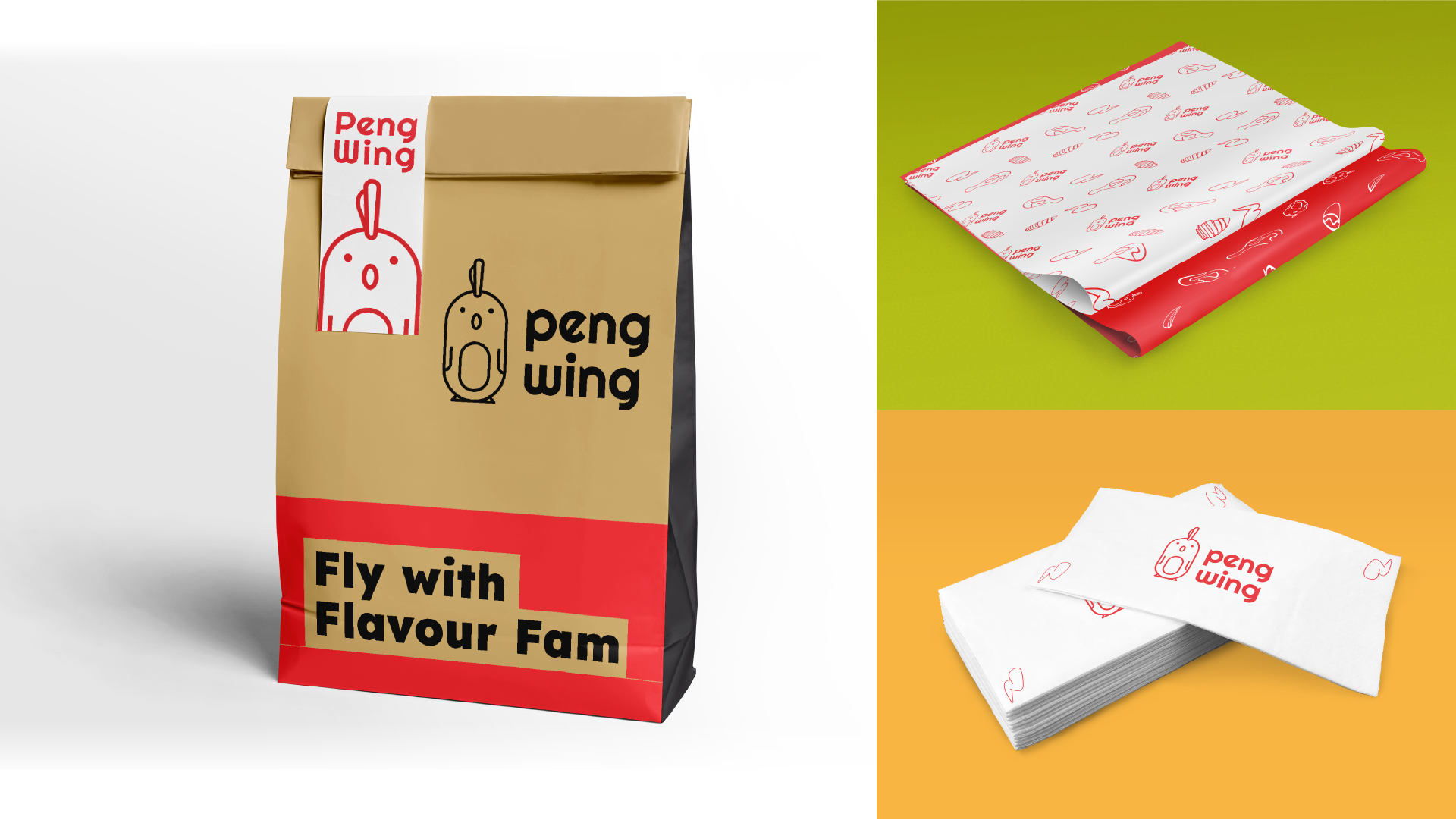
The food would be a mix of different chicken wings from multiple cultures, and this also wanted to be covered in the branding.
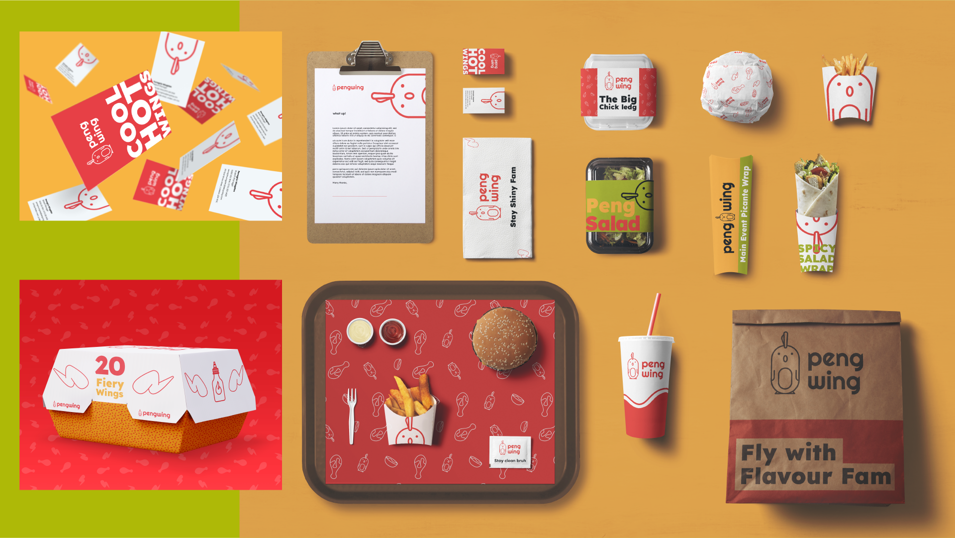
PengWing is a fun, smart, young and engaging fast food restaurant. With a target market of younger audiences and fast food aficionados, PengWing needs to stand out from the crowd and showcase a new way to taste wings!
PengWing has to communicate a sense of irony and street-sense, while also being an inviting brand for a wider demographic and be built to be able to expand into additional audiences bases in time.

What with an already wide range of competitors with wildly different styles, it was important to stand out and showcase a different appeal from the direct and non-direct competitors. Fortunately, there was a lot of space to move in and set up something that merged the youth, street and multicultural pieces, while playing on the name.
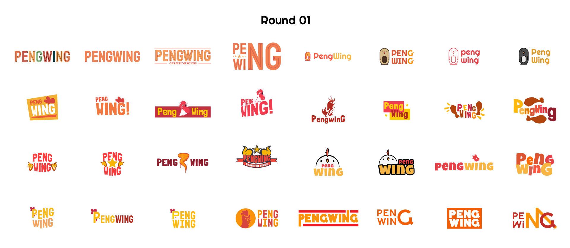
The first round featured several different styles to ensure that no avenues were being missed in initial development, and we tested out against focus groups. From that there were 2 winners to move onto the next round of iteration.

Both of the logos to go through featured these cute, Kawaii styles, with one leaning more into a minimal and urban feel, while the other being more cartoon driven. Again a set of variants were set up and tested, resulting in a merging of the two.
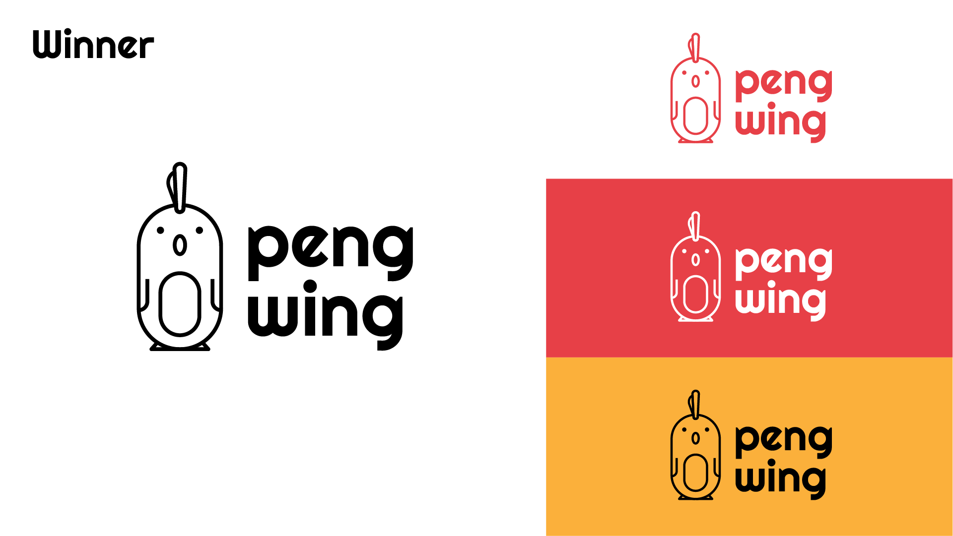
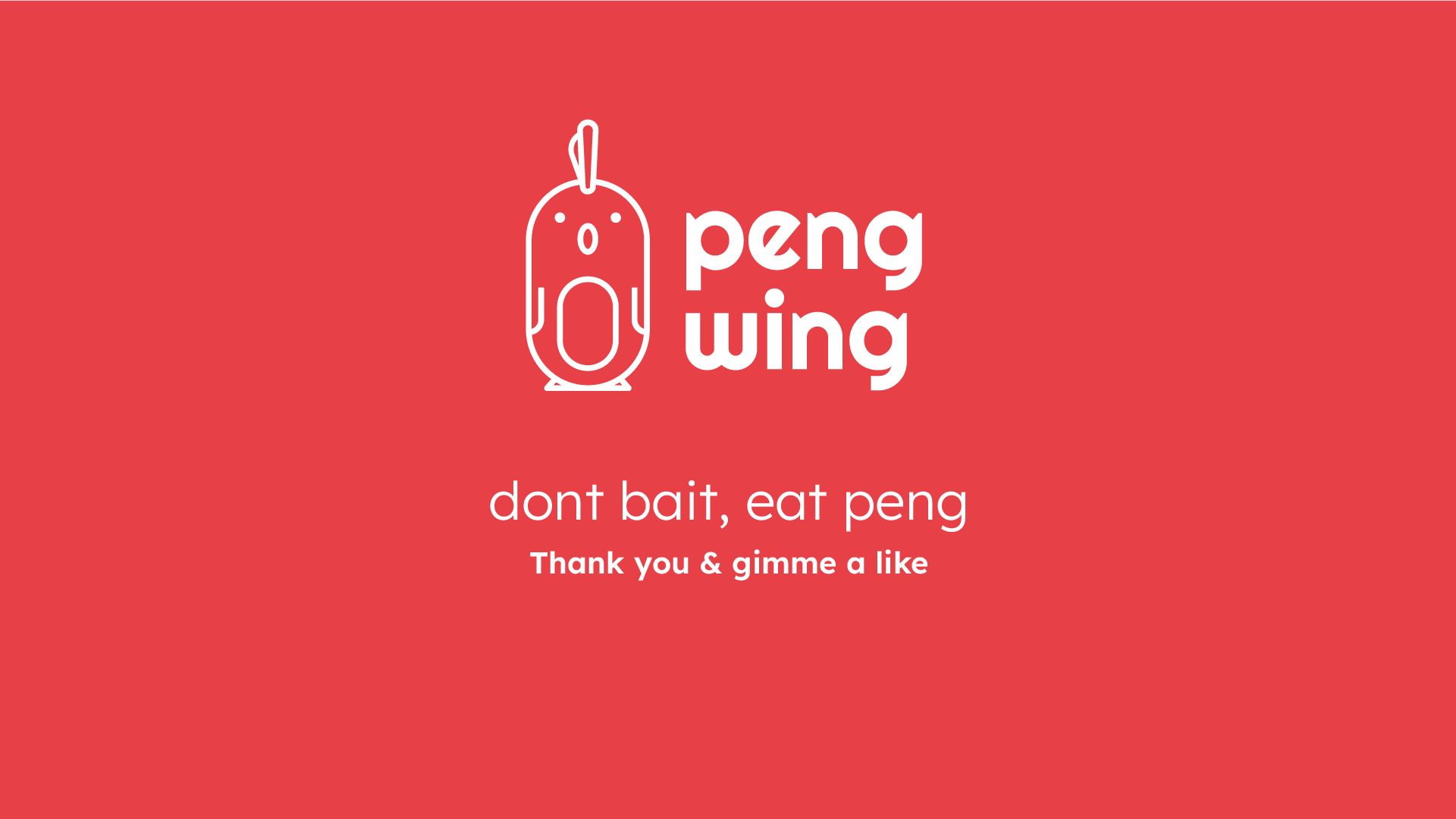
The winning design mainly featured the complete style of the first runner-up, while taking the comb of the second runner-up. This gives a bit more playfulness to the design, gives the character both a dual Mohawk/chicken reference. And finally a good play on a relatively known idea in British animated culture.